Plotting
Note
New in version 1.0.3.
All standard measurements have a Plot() which will generate a plot of the calculated method.
These plots are based on the matplotlib package.
Note
Specifying name will save the figure under the given string. For example .Plot(name='myplot.png')
New in version 1.1.0.
Plotting theoretical calculations
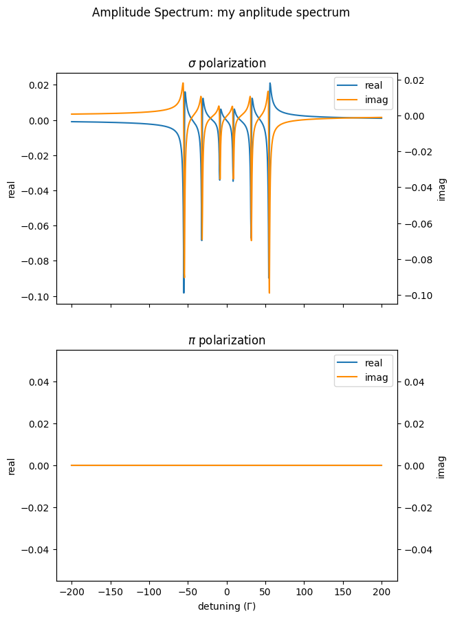
First, we calculate an AmplitudeSpectrum with a linear polarized beam and plot it.
import nexus as nx
import numpy as np

site = nx.Hyperfine(magnetic_field = 33,
                       isotropic = True)

iron = nx.Material.Template(nx.lib.material.Fe)

iron.hyperfine_sites = [site]

layer_Fe = nx.Layer(id = "Fe layer",
                    material = iron,
                    thickness = 3000)

sample = nx.Sample(layers = [layer_Fe])

beam = nx.Beam()
beam.LinearSigma()

exp = nx.Experiment(beam = beam,
                       objects = [sample],
                       isotope = nx.lib.moessbauer.Fe57)

detuning = np.linspace(-200, 200, 1001)

amp_spectrum = nx.AmplitudeSpectrum(experiment = exp,
                                    detuning = detuning,
                                    electronic = False,
                                    id = "my amplitude spectrum")

amp = amp_spectrum.Calculate()

# with all options
amp_spectrum.Plot(sigma=True,
                  pi=True,
                  polar=False,
                  unwrap=True)
Plotting data and fits
When you want to plot measured data and the corresponding fits, there are severla options to change the plot style.
Here we give examples for the EnergySpectrum and TimeSpectrum methods.
Energy and Moessbauer Spectra
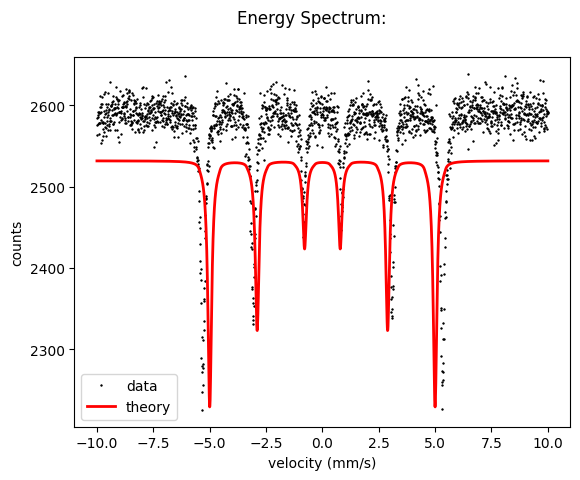
Let us use the fit example from the Hello Nexus section.
import nexus as nx
import numpy as np

data = np.loadtxt('example_spectrum.txt')

velocity_experiment = data[:,0]
intensity_experiment = data[:,1]
site = nx.Hyperfine(magnetic_field = nx.Var(value = 31, min = 25, max = 35, fit = True, id = "magnetic field"),
                isotropic = True)

mat_Fe = nx.Material.Template(nx.lib.material.Fe)

mat_Fe.hyperfine_sites = [site]

layer_Fe = nx.Layer(id = "Fe",
                    material = mat_Fe,
                    thickness = 3000)

sample = nx.Sample(layers = [layer_Fe])

beam = nx.Beam()
beam.Unpolarized()

exp = nx.Experiment(beam = beam,
                    objects = [sample],
                    isotope = nx.lib.moessbauer.Fe57)

spectrum = nx.MoessbauerSpectrum(experiment = exp,
                                 velocity = velocity_experiment,  # the measured velocity
                                 intensity_data = intensity_experiment)  # the measured intensity to be fit


intensity = spectrum.Calculate()

spectrum.Plot(velocity = True)
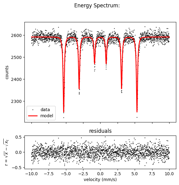
Fit the data
fit = nx.Fit(measurements = [spectrum])

fit.Evaluate()
and plot.
Here you can also see all options for a EnergySpectrum plot, which are in matplotlib style.
spectrum.Plot(data=True,
              residuals=True,
              velocity=True,
              datacolor='black',
              theorycolor='r',
              theorywidth=2,
              datalinestyle='none',
              datamarker='+',
              datamarkersize=2,
              datafillstyle='full',
              legend=True,
              errors=False,
              errorcap=2)
Time Spectrum
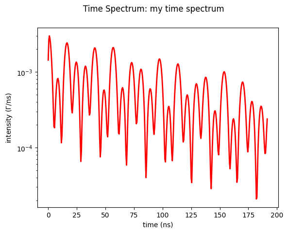
Here’s an example on how to use the Plot() method for a TimeSpectrum.
import nexus as nx
import numpy as np

site = nx.Hyperfine(magnetic_field = 33,
                    magnetic_theta = 90,
                    magnetic_phi = 0,
                    isotropic = False)

iron = nx.Material.Template(nx.lib.material.Fe)

iron.hyperfine_sites = [site]

layer_Fe = nx.Layer(id = "Fe layer",
                    material = iron,
                    thickness = 3000)

sample = nx.Sample(layers = [layer_Fe])

beam = nx.Beam()
beam.LinearSigma()

exp = nx.Experiment(beam = beam,
                    objects = [sample],
                    isotope = nx.lib.moessbauer.Fe57)

time_spectrum = nx.TimeSpectrum(experiment = exp,
                                time_length = 200,
                                time_step = 0.5,
                                bunch_spacing = 192.2, # PETRA III bunch spacing
                                id = "my time spectrum")

time, intensity = time_spectrum.Calculate()
Now we just use the plot method
time_spectrum.Plot()
For plot demonstration purposes, we use this spectrum and try to fit it. Therefore we scale it to get to values larger then one and make it integer values, as a real histogram would have.
intensity = np.round(1e5* intensity)
and use this as a data set to be fit
time_spectrum_2 = nx.TimeSpectrum(experiment = exp,
time_data = time,
intensity_data = intensity,
time_length = 200,
time_step = 0.2,
bunch_spacing = 192.2, # PETRA III bunch spacing
id = "my time spectrum")
time_spectrum_2.Calculate()
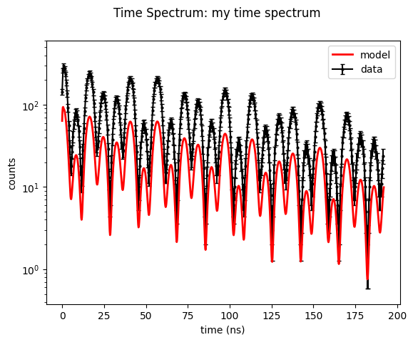
# plot with error bars in intensity_data
time_spectrum_2.Plot(errors=True)
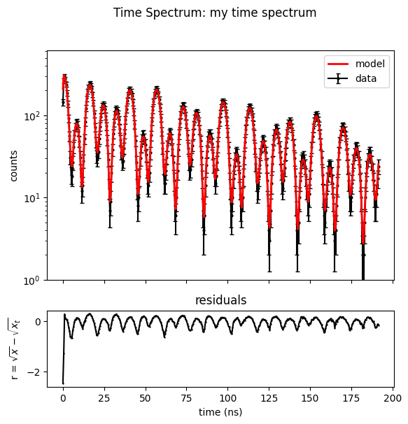
This time we fit with the gradient free local optimization method Subplex.
fit = nx.Fit([time_spectrum_2])

fit.options.method = "Subplex"

fit()
and plot the result.
Here you can also see all options for a TimeSpectrum plot.
time_spectrum_2.Plot(data=True,
                     residuals=True,
                     errors=True,
                     datacolor='black',
                     theorycolor='r',
                     theorywidth=2,
                     datalinestyle='none',
                     datamarker='+',
                     datamarkersize=2,
                     datafillstyle='full',
                     legend=True)
Notebooks
plot amplitude spectrum - nb_plot_amplitude_spectrum.ipynb.
plot moessbauer spectrum - nb_plot_moessbauer_spectrum.ipynb.
plot time spectrum - nb_plot_time_spectrum.ipynb.
Please have a look to the API Reference for more information.